> ## Documentation Index
> Fetch the complete documentation index at: https://docs.world.org/llms.txt
> Use this file to discover all available pages before exploring further.

# Design Guidelines

This page gives you quick, visual rules to meet a high design standard for mini apps. Each image shows the intended pattern and a short usage note so you can apply it fast.

## Grid and spacing

**Usage**

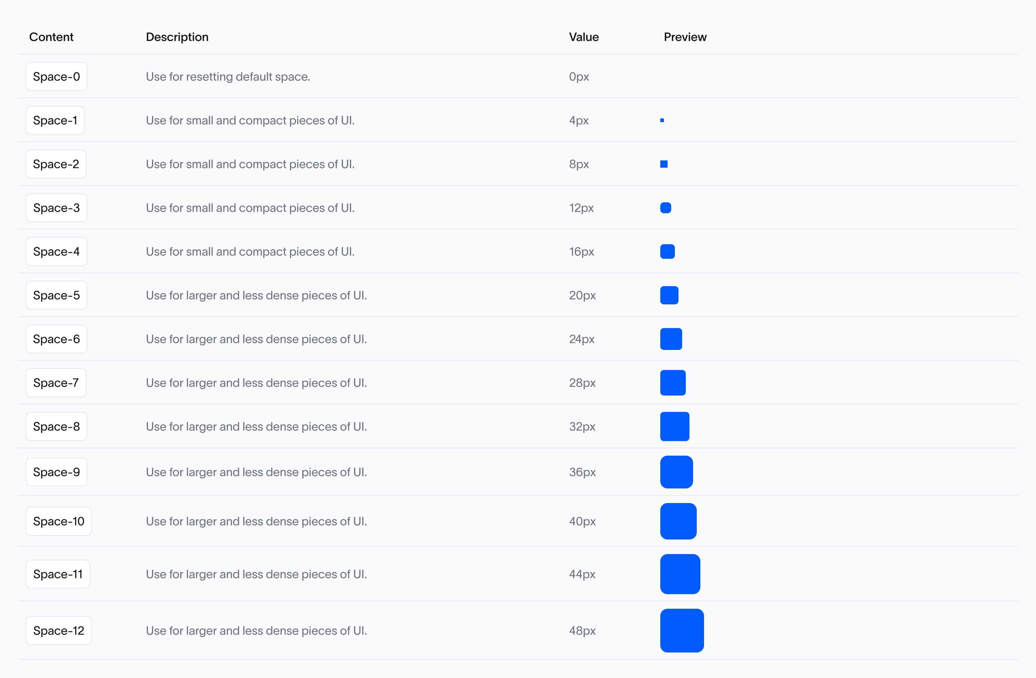
Padding is set to a default of 24px, providing ample breathing room around elements while maintaining a clean and structured appearance.
<img src="https://mintcdn.com/tfh/a1EEcbcaLLd6WDD5/images/docs/mini-apps/guidelines/base-unit.png?fit=max&auto=format&n=a1EEcbcaLLd6WDD5&q=85&s=a0513fd9ac63eebd91a14ce0796eae80" alt="Base unit" width="3408" height="2232" data-path="images/docs/mini-apps/guidelines/base-unit.png" />

## Paddings

**Usage**

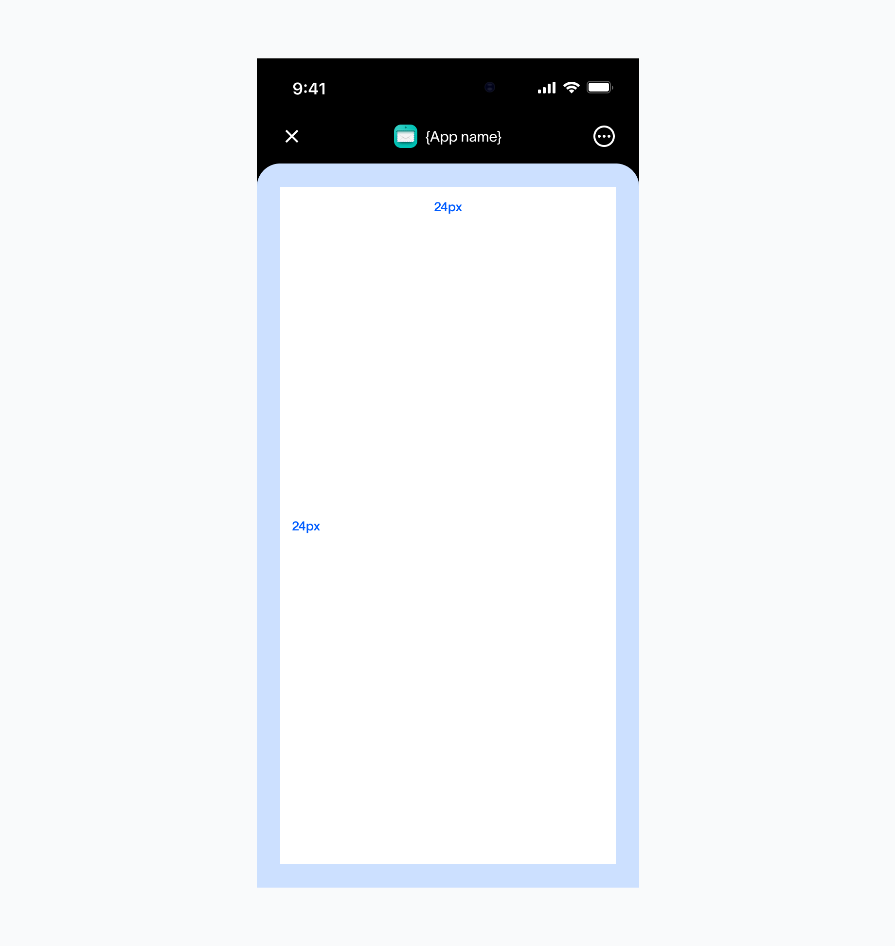
Padding is set to a default of 24px, providing ample breathing room around elements while maintaining a clean and structured appearance.

<img src="https://mintcdn.com/tfh/Cx1nS-GdNBErhlkt/images/docs/mini-apps/guidelines/paddings.png?fit=max&auto=format&n=Cx1nS-GdNBErhlkt&q=85&s=f7142d97fb8a1b059b56cbc8791d5cae" alt="Paddings" width="1840" height="1944" data-path="images/docs/mini-apps/guidelines/paddings.png" />

## Navigation bar

**Usage**

Except for the control components of Mini Apps in the upper-right corner, all the other contents can be configured for custom designs. If interactive elements need to be set near the control components of Mini Apps, the developer shall note that whether the interaction area will conflict with the control components, and whether the operation is easy.
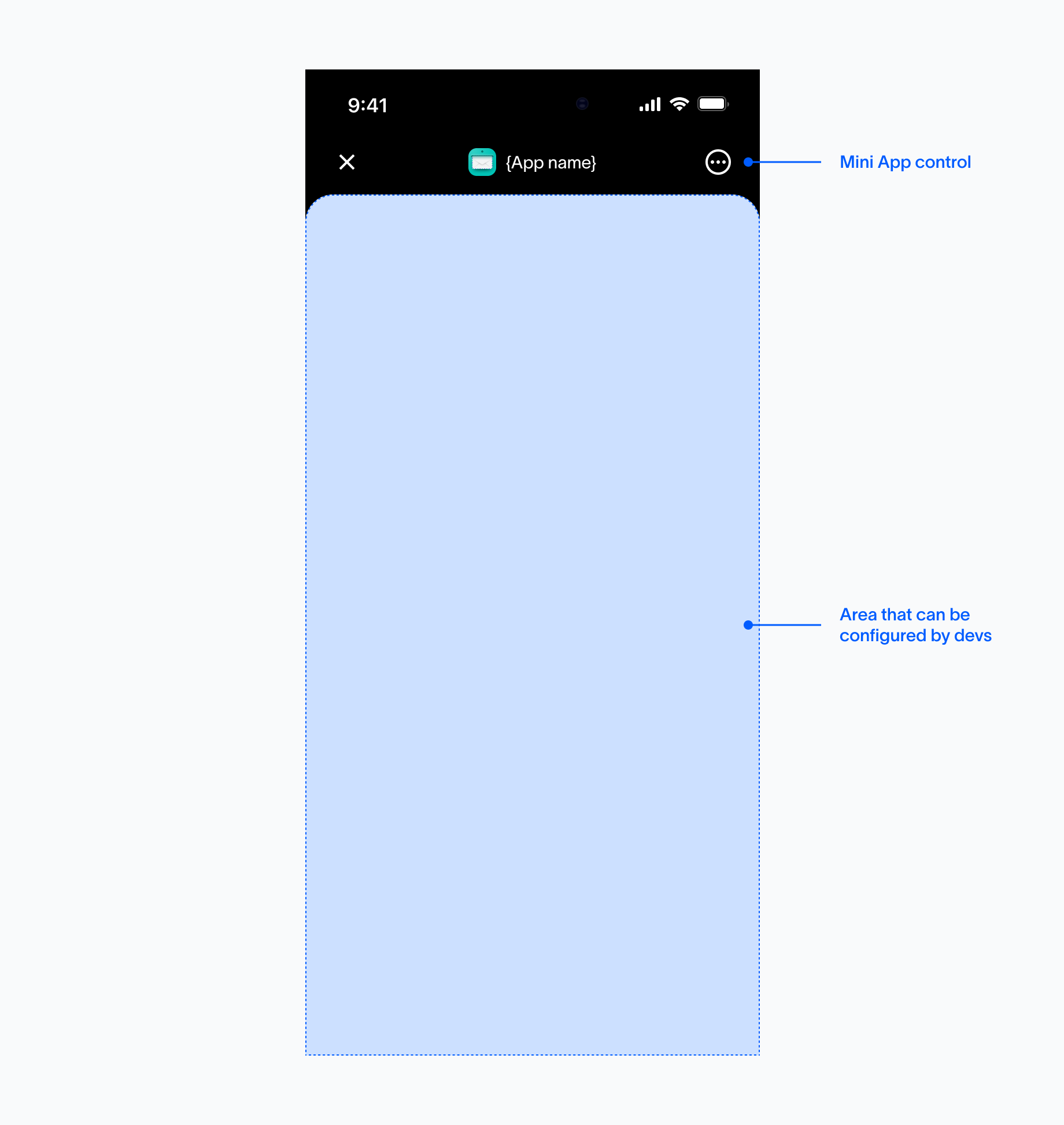
<img src="https://mintcdn.com/tfh/Cx1nS-GdNBErhlkt/images/docs/mini-apps/guidelines/navigation-bar.png?fit=max&auto=format&n=Cx1nS-GdNBErhlkt&q=85&s=682863bb1af3484f94f65bffb608486d" alt="Navigation bar" width="1840" height="1944" data-path="images/docs/mini-apps/guidelines/navigation-bar.png" />

## Main pages

<div className="grid grid-cols-1 items-start gap-6 lg:grid-cols-2">
  <div>
    <img src="https://mintcdn.com/tfh/Cx1nS-GdNBErhlkt/images/docs/mini-apps/guidelines/main-pages-1.png?fit=max&auto=format&n=Cx1nS-GdNBErhlkt&q=85&s=08a1949650a2398b606a35fa4faebf11" alt="One clear task per page" width="1840" height="1944" data-path="images/docs/mini-apps/guidelines/main-pages-1.png" />

    <p className="text-muted-foreground mt-2 text-sm">
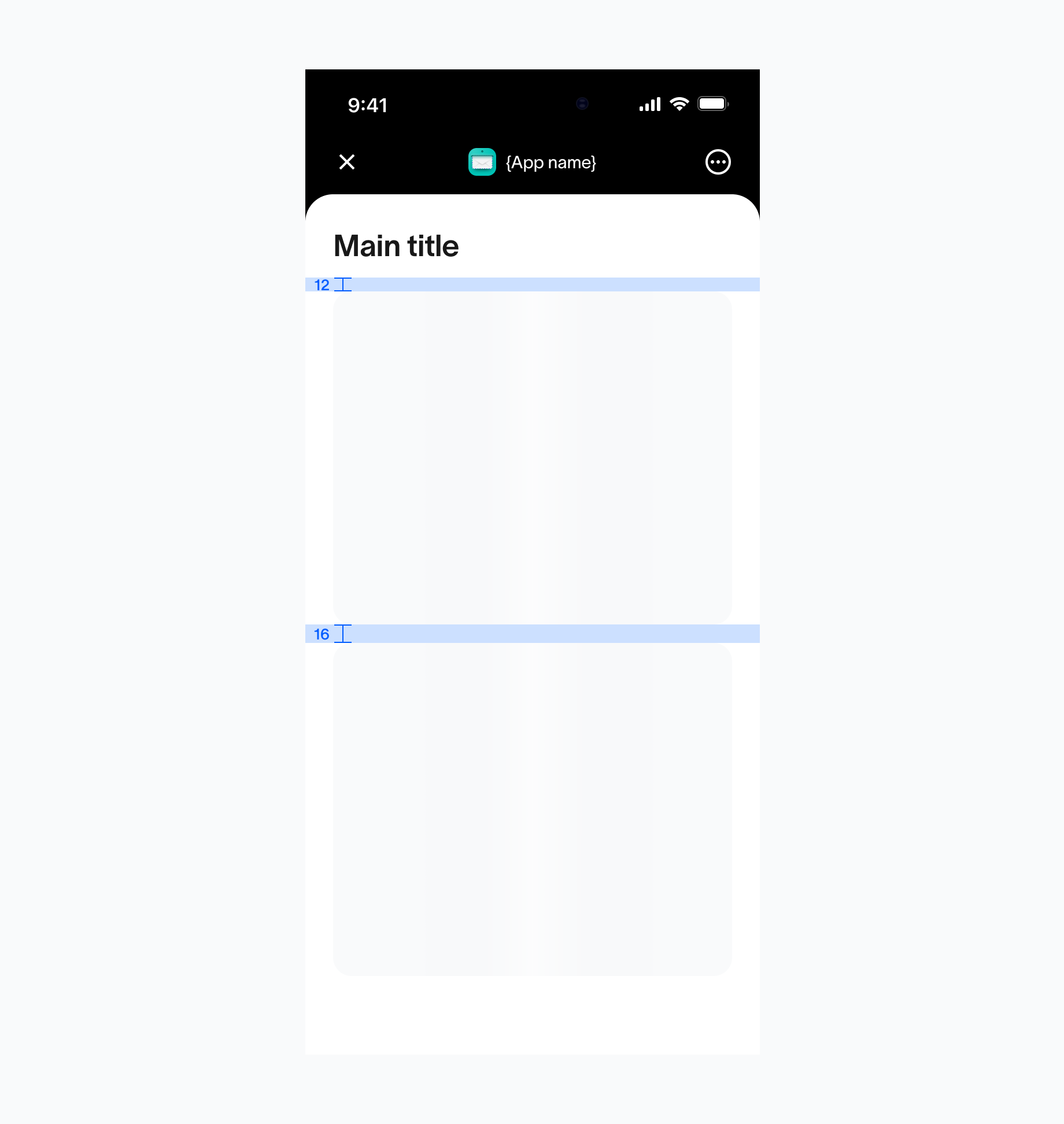
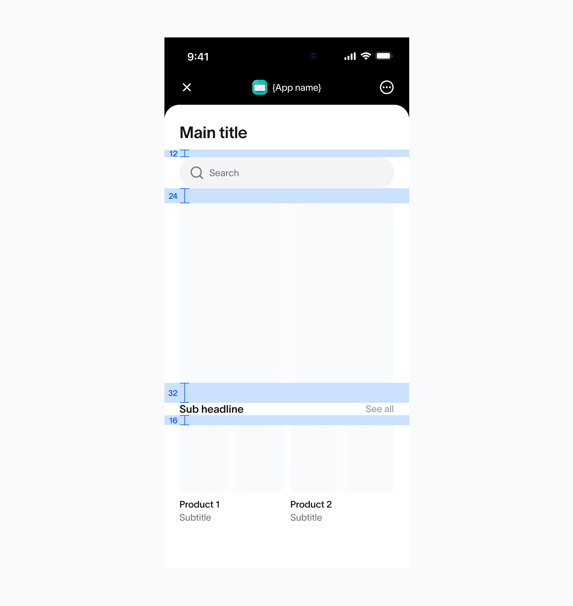
      The default space between a header and its associated content is 16px, and
      the same 16px spacing applies between elements within a section. This
      consistent use of spacing helps create a clean visual structure and
      predictable rhythm across the UI.
    </p>
  </div>

  <div>
    <img src="https://mintcdn.com/tfh/Cx1nS-GdNBErhlkt/images/docs/mini-apps/guidelines/main-pages-2.png?fit=max&auto=format&n=Cx1nS-GdNBErhlkt&q=85&s=93a760853eb499867f8415276f9f8456" alt="Keep CTAs visible" width="1840" height="1944" data-path="images/docs/mini-apps/guidelines/main-pages-2.png" />

    <p className="text-muted-foreground mt-2 text-sm">
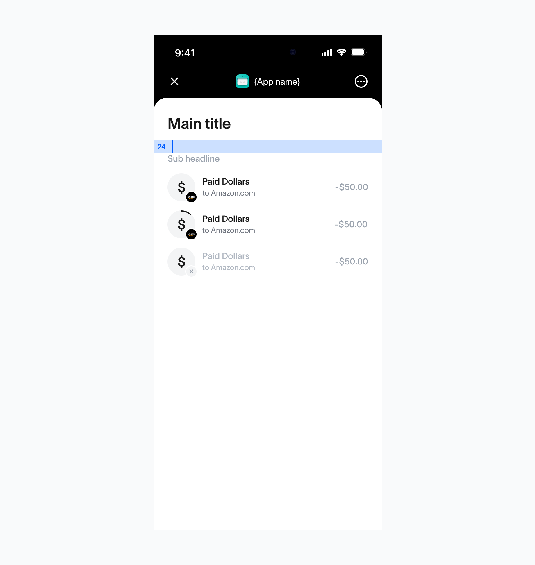
      The default space between sections is set to 32px, helping to create clear
      separation between distinct areas of content. The space between the search
      bar and the content below is 24px, while the space between a sub-headline
      and its associated content is 16px.
    </p>
  </div>

  <div>
    <img src="https://mintcdn.com/tfh/Cx1nS-GdNBErhlkt/images/docs/mini-apps/guidelines/main-pages-4.png?fit=max&auto=format&n=Cx1nS-GdNBErhlkt&q=85&s=1bb942b53b7c9cd756a7e2ed7497d733" alt="Minimize unnecessary scrolling" width="1840" height="1944" data-path="images/docs/mini-apps/guidelines/main-pages-4.png" />

    <p className="text-muted-foreground mt-2 text-sm">
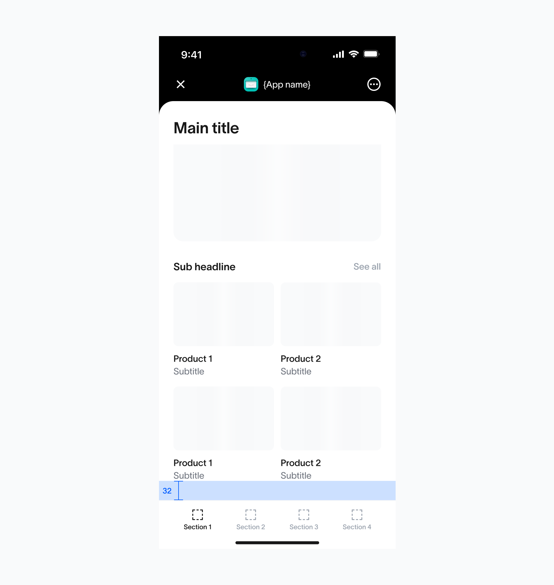
      The default space between header and a section that starts with a sub
      headline is set to 24px.
    </p>
  </div>

  <div>
    <img src="https://mintcdn.com/tfh/Cx1nS-GdNBErhlkt/images/docs/mini-apps/guidelines/main-pages-5.png?fit=max&auto=format&n=Cx1nS-GdNBErhlkt&q=85&s=3ca52483d771e6996c4bebb689b3274c" alt="Prioritize primary actions" width="1840" height="1944" data-path="images/docs/mini-apps/guidelines/main-pages-5.png" />

    <p className="text-muted-foreground mt-2 text-sm">
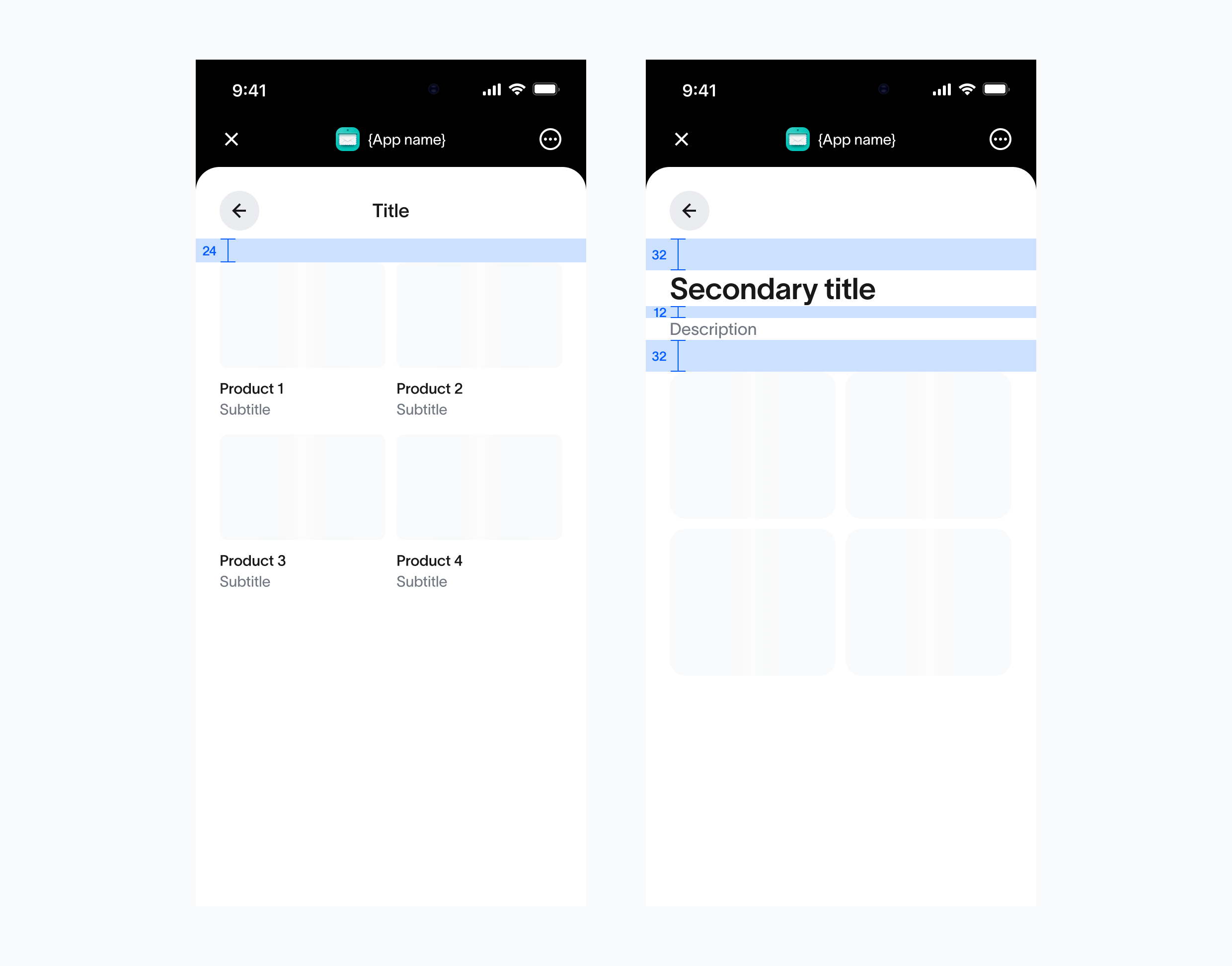
      The default space between last item inside the scrollable area if a bottom
      bar is presented is 32px.
    </p>
  </div>
</div>

## Secondary pages

**Usage**

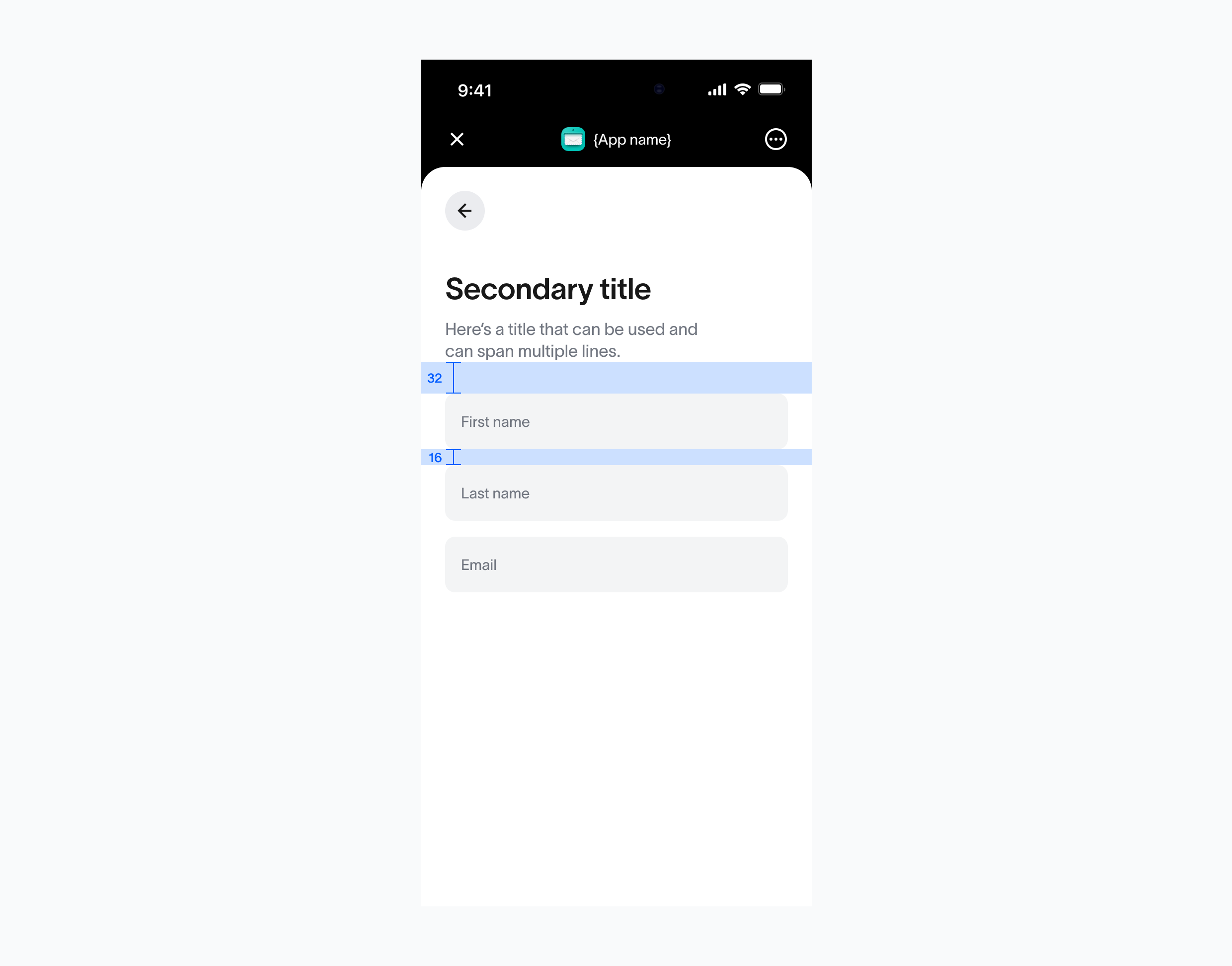
The default space between a header and its associated content is 24px, while the space between a header and a secondary title is 32px. The space between secondary title and description should be 12px.

<div className="grid grid-cols-1 items-start gap-6 lg:grid-cols-2">
  <img src="https://mintcdn.com/tfh/Cx1nS-GdNBErhlkt/images/docs/mini-apps/guidelines/secondary-pages-1.png?fit=max&auto=format&n=Cx1nS-GdNBErhlkt&q=85&s=eea026c9f599db7f6b733d33c569ee01" alt="Secondary 1" className="mx-auto w-full max-w-[840px]" width="2480" height="1944" data-path="images/docs/mini-apps/guidelines/secondary-pages-1.png" />

  <img src="https://mintcdn.com/tfh/Cx1nS-GdNBErhlkt/images/docs/mini-apps/guidelines/secondary-pages-2.png?fit=max&auto=format&n=Cx1nS-GdNBErhlkt&q=85&s=c021586ce1c9bb53017bdb607f9261c0" alt="Secondary 2" className="mx-auto w-full max-w-[840px]" width="2480" height="1944" data-path="images/docs/mini-apps/guidelines/secondary-pages-2.png" />
</div>

## Tab bar (Android vs iOS)

**Usage**

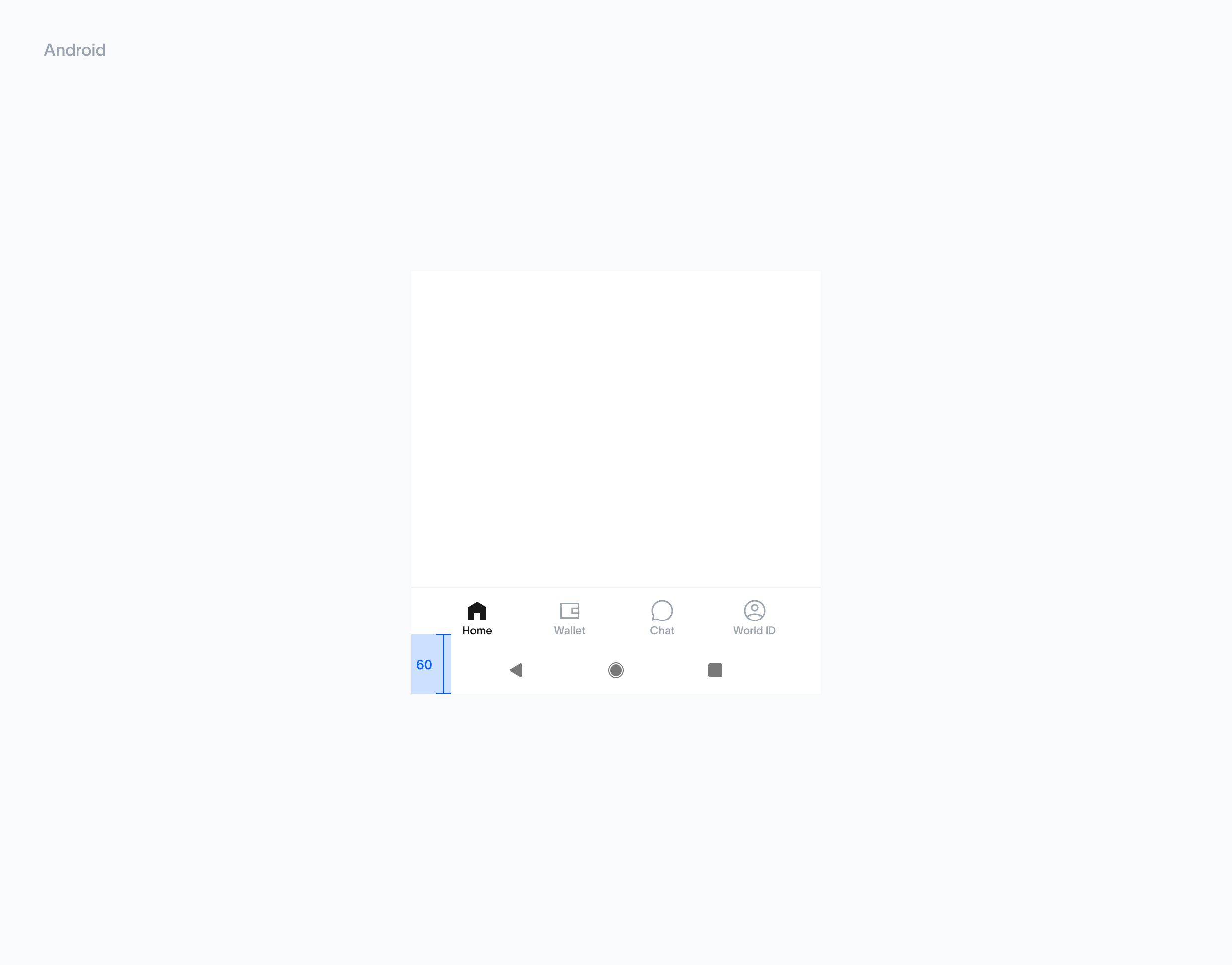
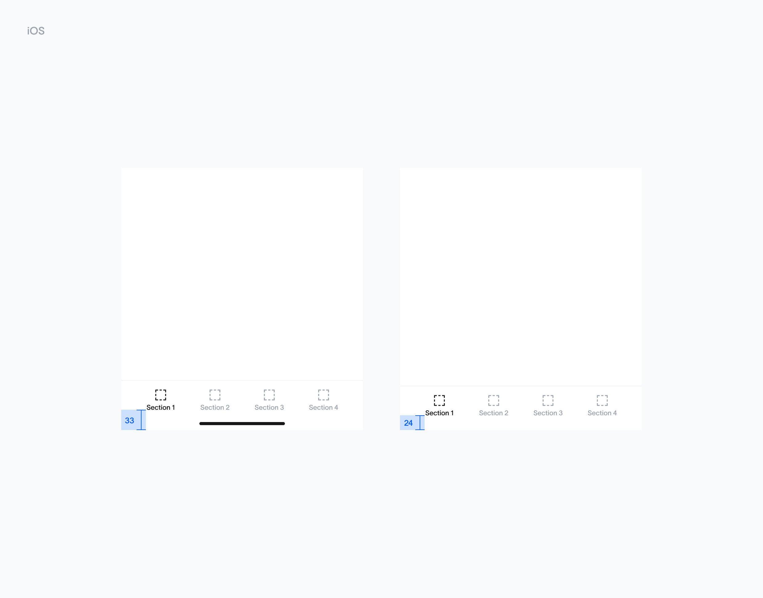
Navigation bar is positioned with a 12px space from the iOS & Android bottom bar, ensuring optimal accessibility and a comfortable tap area.

<div className="grid grid-cols-1 items-start gap-6 lg:grid-cols-2">
  <div>
    <img src="https://mintcdn.com/tfh/Cx1nS-GdNBErhlkt/images/docs/mini-apps/guidelines/tab-bar-android.png?fit=max&auto=format&n=Cx1nS-GdNBErhlkt&q=85&s=e3da95feb207e7a7d4eb1276a979c473" alt="Tab bar Android" className="mx-auto w-full max-w-[840px]" width="2480" height="1944" data-path="images/docs/mini-apps/guidelines/tab-bar-android.png" />
  </div>

  <div>
    <img src="https://mintcdn.com/tfh/Cx1nS-GdNBErhlkt/images/docs/mini-apps/guidelines/tab-bar-ios.png?fit=max&auto=format&n=Cx1nS-GdNBErhlkt&q=85&s=fdf8fba366cba5a13bc2dc86b4c4cb70" alt="Tab bar iOS" className="mx-auto w-full max-w-[840px]" width="2480" height="1944" data-path="images/docs/mini-apps/guidelines/tab-bar-ios.png" />
  </div>
</div>

## Drawers / sheets (Android vs iOS)

**Usage**

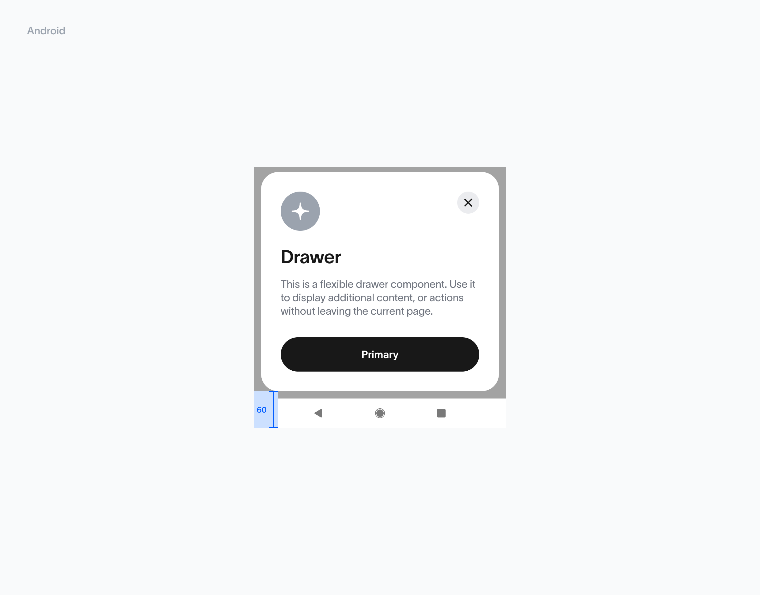
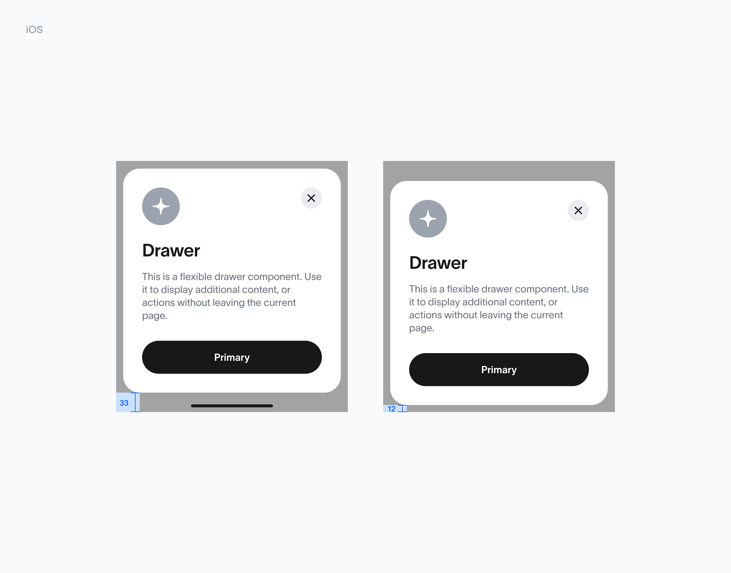
Drawer is positioned with a 12px space from the iOS & Android bottom bar, ensuring optimal accessibility and a comfortable tap area.

<div className="grid grid-cols-1 items-start gap-6 lg:grid-cols-2">
  <div>
    <img src="https://mintcdn.com/tfh/Cx1nS-GdNBErhlkt/images/docs/mini-apps/guidelines/drawers-android.png?fit=max&auto=format&n=Cx1nS-GdNBErhlkt&q=85&s=e14173c4fa3fa042a6a5654dd7b3876c" alt="Drawers Android" className="mx-auto w-full max-w-[840px]" width="2480" height="1944" data-path="images/docs/mini-apps/guidelines/drawers-android.png" />
  </div>

  <div>
    <img src="https://mintcdn.com/tfh/Cx1nS-GdNBErhlkt/images/docs/mini-apps/guidelines/drawers-ios.png?fit=max&auto=format&n=Cx1nS-GdNBErhlkt&q=85&s=b806b691e0b3e0079af6553354d0cfaa" alt="Drawers iOS" className="mx-auto w-full max-w-[840px]" width="2480" height="1944" data-path="images/docs/mini-apps/guidelines/drawers-ios.png" />
  </div>
</div>

## Toasts (Android vs iOS)

**Usage**

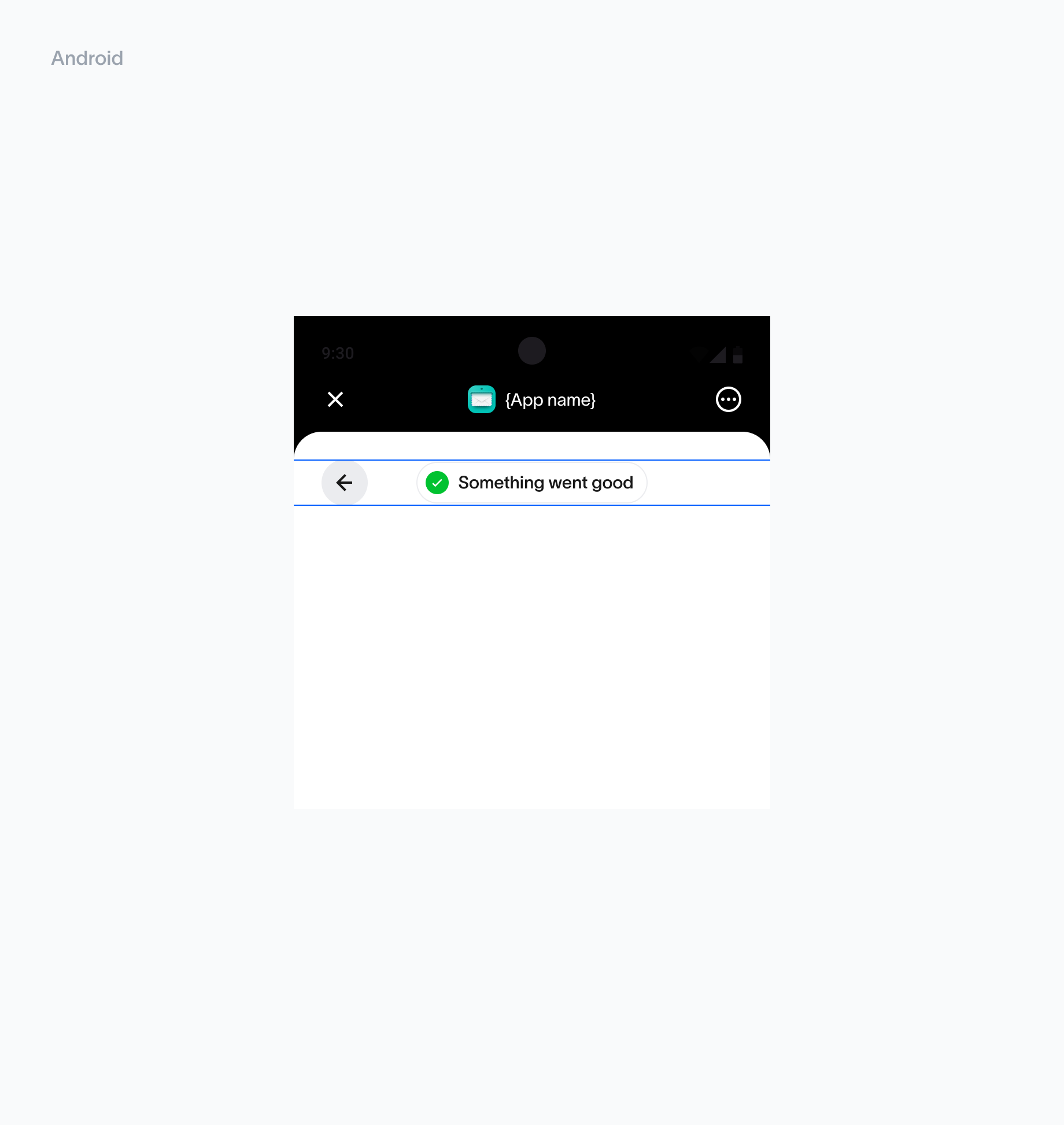
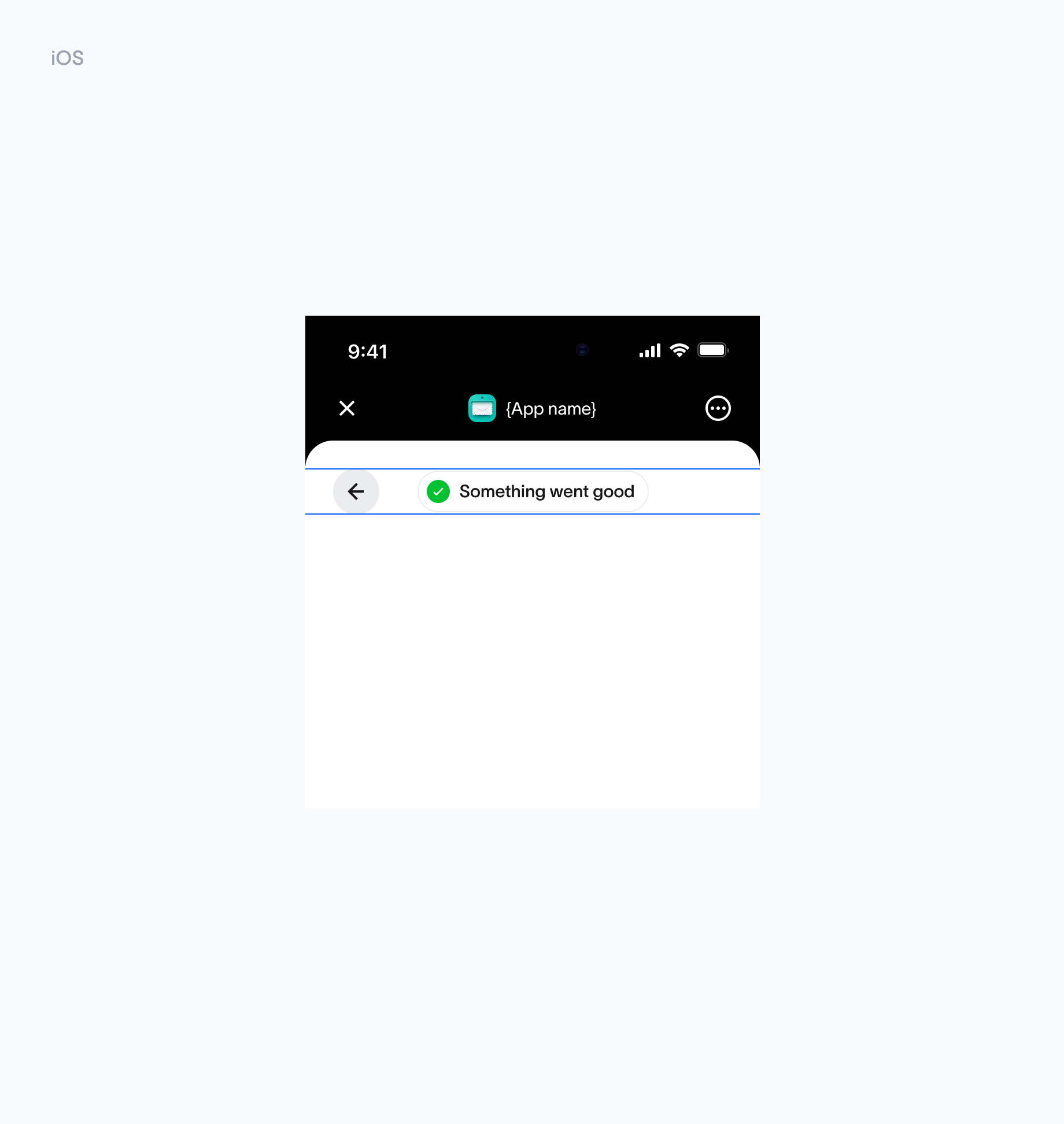
The toast message should be horizontally centered and positioned directly below the header to ensure visibility without disrupting user interaction.

<div className="grid grid-cols-1 items-start gap-6 lg:grid-cols-2">
  <div>
    <img src="https://mintcdn.com/tfh/Cx1nS-GdNBErhlkt/images/docs/mini-apps/guidelines/toast-android.png?fit=max&auto=format&n=Cx1nS-GdNBErhlkt&q=85&s=68e487afb4f9978575fe66b1ec592918" alt="Toast Android" className="mx-auto w-full max-w-[840px]" width="1840" height="1944" data-path="images/docs/mini-apps/guidelines/toast-android.png" />
  </div>

  <div>
    <img src="https://mintcdn.com/tfh/Cx1nS-GdNBErhlkt/images/docs/mini-apps/guidelines/toast-ios.png?fit=max&auto=format&n=Cx1nS-GdNBErhlkt&q=85&s=ed94c21236d63bd302c004ac5bff4a6a" alt="Toast iOS" className="mx-auto w-full max-w-[840px]" width="1840" height="1944" data-path="images/docs/mini-apps/guidelines/toast-ios.png" />
  </div>
</div>

## Keyboard handling (Android vs iOS)

**Usage**

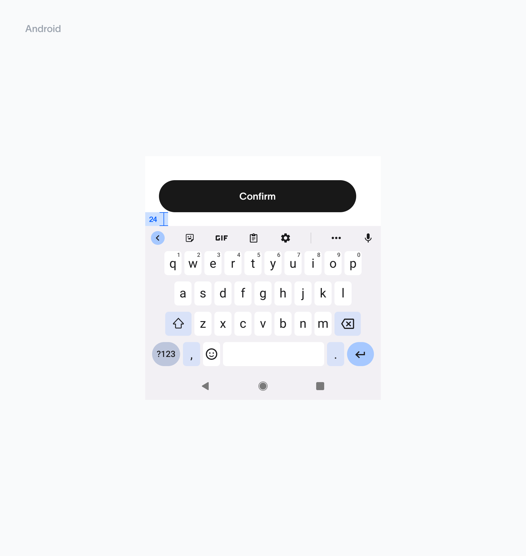
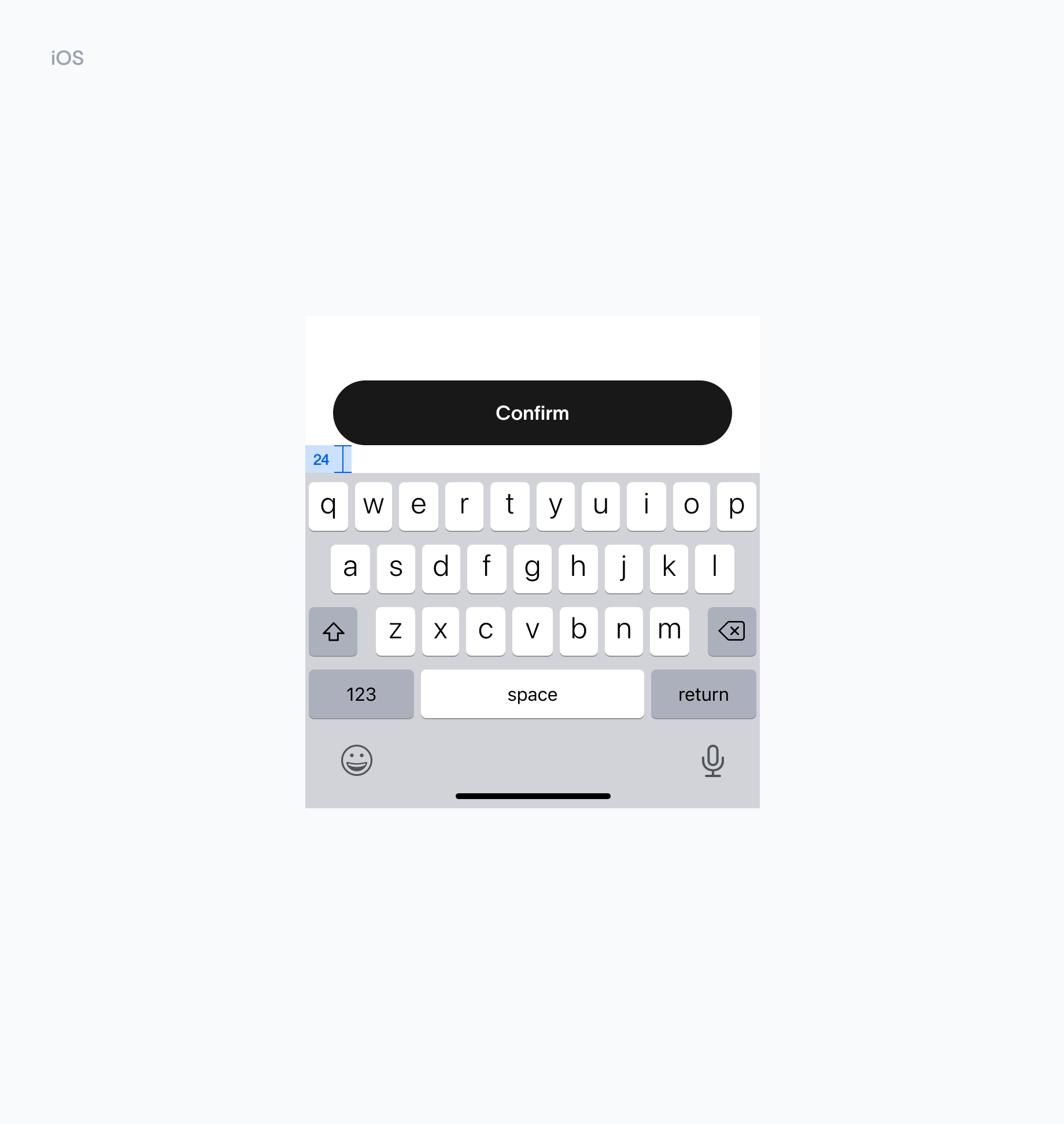
Buttons are placed 24px above the active keyboard. This spacing ensures that buttons remain easily accessible and visually distinct, even when the keyboard is active, preventing accidental taps or overlap.

<div className="grid grid-cols-1 items-start gap-6 lg:grid-cols-2">
  <div>
    <img src="https://mintcdn.com/tfh/Cx1nS-GdNBErhlkt/images/docs/mini-apps/guidelines/keyboard-android.png?fit=max&auto=format&n=Cx1nS-GdNBErhlkt&q=85&s=24187fc461c7c0147f2cd94b725ce2fe" alt="Keyboard Android" className="mx-auto w-full max-w-[840px]" width="1840" height="1944" data-path="images/docs/mini-apps/guidelines/keyboard-android.png" />
  </div>

  <div>
    <img src="https://mintcdn.com/tfh/Cx1nS-GdNBErhlkt/images/docs/mini-apps/guidelines/keyboard-ios.png?fit=max&auto=format&n=Cx1nS-GdNBErhlkt&q=85&s=8b7806d2363737cb635827192b588744" alt="Keyboard iOS" className="mx-auto w-full max-w-[840px]" width="1840" height="1944" data-path="images/docs/mini-apps/guidelines/keyboard-ios.png" />
  </div>
</div>

## Bottom safe area space (Android vs iOS)

**Usage**

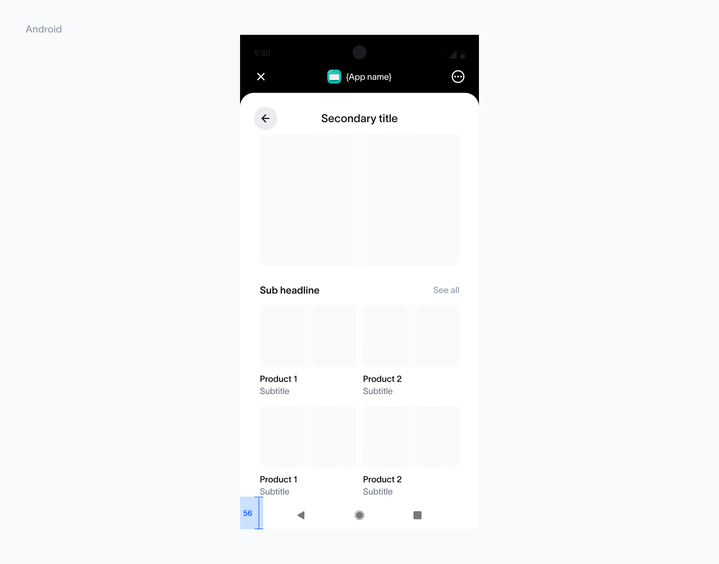
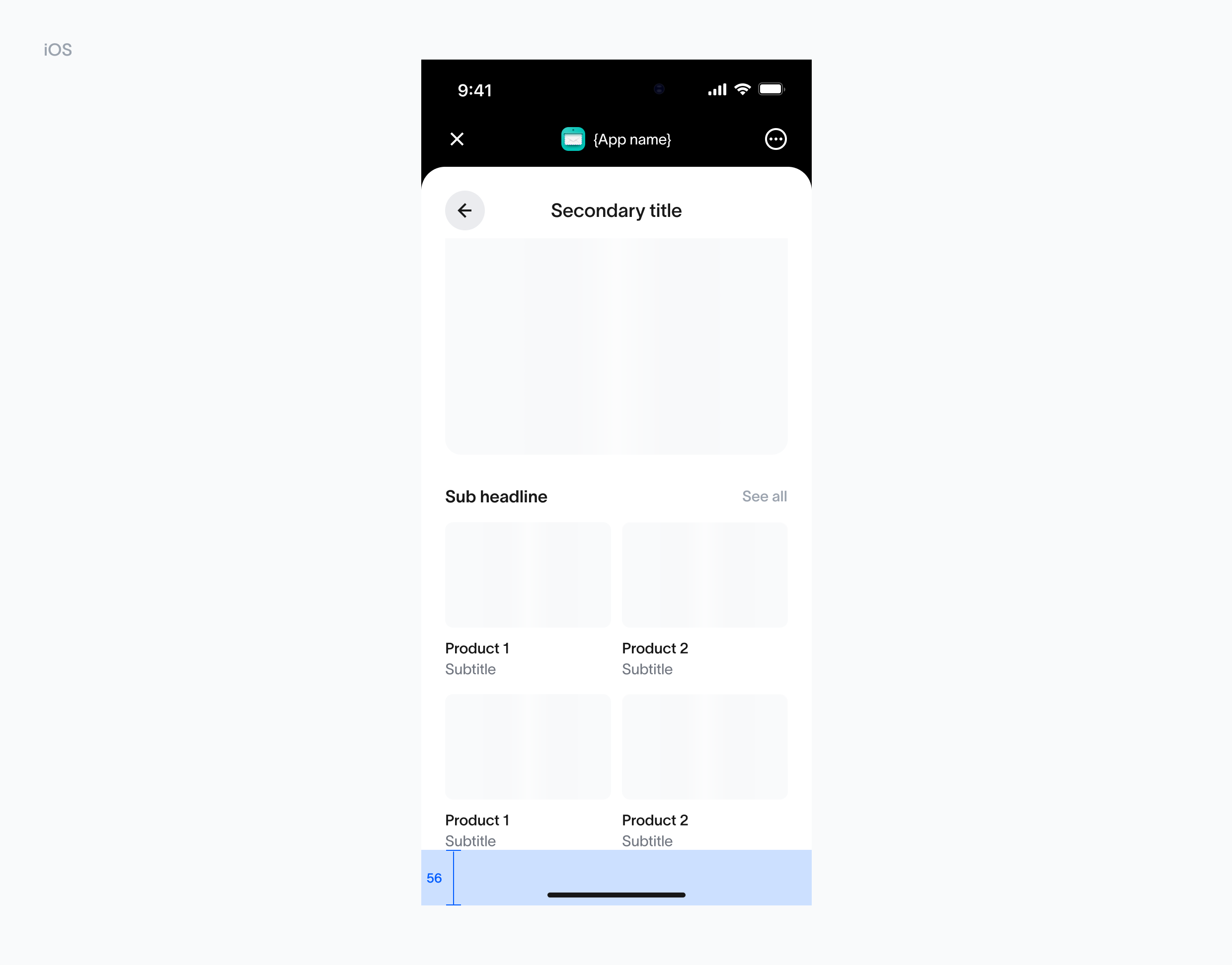
Buttons are positioned with a 24px space from the iOS bottom bar, ensuring optimal accessibility and a comfortable tap area.

<div className="grid grid-cols-1 items-start gap-6 lg:grid-cols-2">
  <div>
    <img src="https://mintcdn.com/tfh/VqXXvgQ8G-9iljWm/images/docs/mini-apps/guidelines/bottom-space-android.png?fit=max&auto=format&n=VqXXvgQ8G-9iljWm&q=85&s=1ee0d4c63b3f173bebf5e3f9421eab2f" alt="Bottom space Android" className="mx-auto w-full max-w-[840px]" width="2480" height="1944" data-path="images/docs/mini-apps/guidelines/bottom-space-android.png" />
  </div>

  <div>
    <img src="https://mintcdn.com/tfh/VqXXvgQ8G-9iljWm/images/docs/mini-apps/guidelines/bottom-space-ios.png?fit=max&auto=format&n=VqXXvgQ8G-9iljWm&q=85&s=973c75310cdcc2b0dff0f0ee327415aa" alt="Bottom space iOS" className="mx-auto w-full max-w-[840px]" width="2480" height="1944" data-path="images/docs/mini-apps/guidelines/bottom-space-ios.png" />
  </div>
</div>

## States

**Usage**

Middle alignment ensures consistency across various screen sizes and component states, making the interface feel polished and intentional. This alignment strategy is especially effective for empty states, loading indicators, or other transient states, providing a seamless and cohesive user experience.

<img src="https://mintcdn.com/tfh/Cx1nS-GdNBErhlkt/images/docs/mini-apps/guidelines/states.png?fit=max&auto=format&n=Cx1nS-GdNBErhlkt&q=85&s=4375c72af514428b688db039ec02eff5" alt="Common states" width="2480" height="1944" data-path="images/docs/mini-apps/guidelines/states.png" />